
Flyby Disc Exchange
Flyby Disc Exchange is an online retailer for all things disc golf related. It is set apart from its competitors for its members only online marketplace which is used for the purchase, sale, and trade of unique or collectable disc golf equipment and goods.
My Role
Concept, User Research, Design & Visuals, UX/UI
Project Duration
4 Weeks

Kickoff
The project began with foundational questions to guide the design process: Who is our primary user? What are their main objectives? Why would they choose our online retailer over competitors?
Searching the web for golf discs returns hundreds of options for places to shop. Even major platforms like Amazon offer the equipment needed to enjoy this growing niche sport. However, for enthusiasts seeking rare collectibles or trying to replace a perfectly beat-in, out-of-production disc, the options narrow significantly.
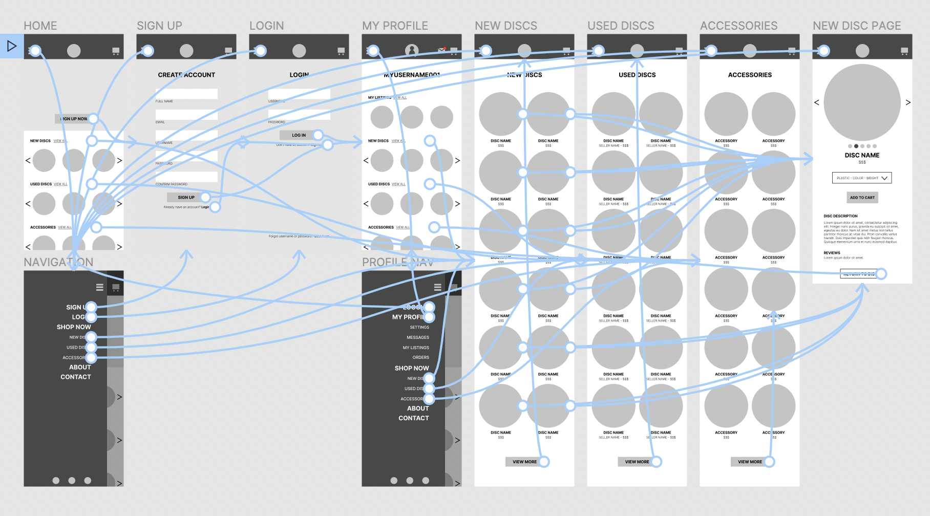
To address this gap, the main goal of Flyby Disc Exchange is to create a user-friendly mobile website tailored to the sport’s most dedicated collectors. The platform provides an exclusive marketplace to search for, buy, and sell rare discs, while also offering a streamlined storefront for newcomers to easily purchase the equipment they need to get started.
To ensure our design met the diverse needs of these audiences, we employed a mix of user research techniques, including interviews, empathy mapping, and persona development. These efforts provided deep insights into our users, enabling us to design an experience that caters to both passionate collectors and beginners alike.
Meet Our Users
Penny
Penny is a 27 year old designer who found a passion for disc golf during the early stages of the pandemic. What started as a reason to get out of the house, has turned into an obsession. While Penny enjoys physical aspects of the game, being a part of a community and adding to her growing collection is what keeps her invested in the sport.

George
George is a 58 year old insurance adjuster and has been playing disc golf on and off for over 15 years. He’s collected a large amount of discs over those years, some of which may have gained a lot of value. However, he’s not kept up with the sport in the last few years and is looking for a way to sell some of his collection, but he has little knowledge of his discs current value.


Refining The Design Through Usability Studies
Two rounds of usability studies were conducted to refine the initial design. The first study focused on guiding the evolution from wireframes to mockups, while the second leveraged a high-fidelity prototype to identify areas within the mockups that required further enhancement.
Round 1 Findings:
Users expressed the need for a clear visual indicator to confirm they were logged into their profile.
Round 2 Findings:
Users desired a more prominent and accessible search function to improve navigation and usability.
Incorporating these insights, I iteratively refined the design to address user needs while also prioritizing accessibility. Enhancements included:
Product Visualization: Individual images of each disc were added to allow users to visually inspect products, supported by detailed descriptions for clarity.
Alt Text: All images were supplemented with alt text to accommodate visually impaired users relying on screen readers.
Enhanced Navigation: Intuitive icons were integrated to streamline navigation and provide a more user-friendly experience.
These adjustments ensured the design not only met the functional requirements of its diverse user base but also adhered to best practices in accessibility, delivering a seamless and inclusive experience.


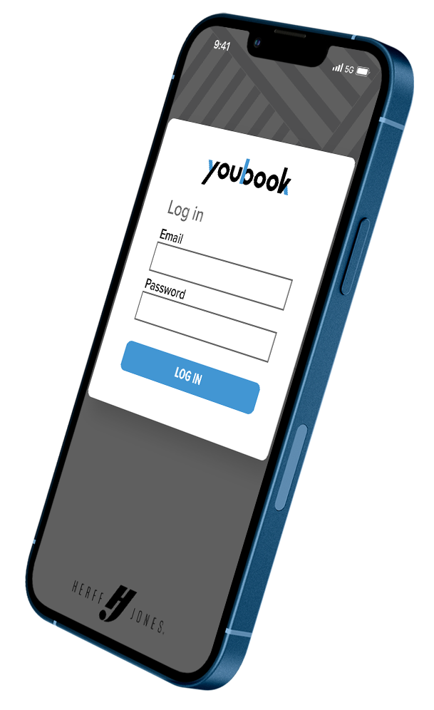
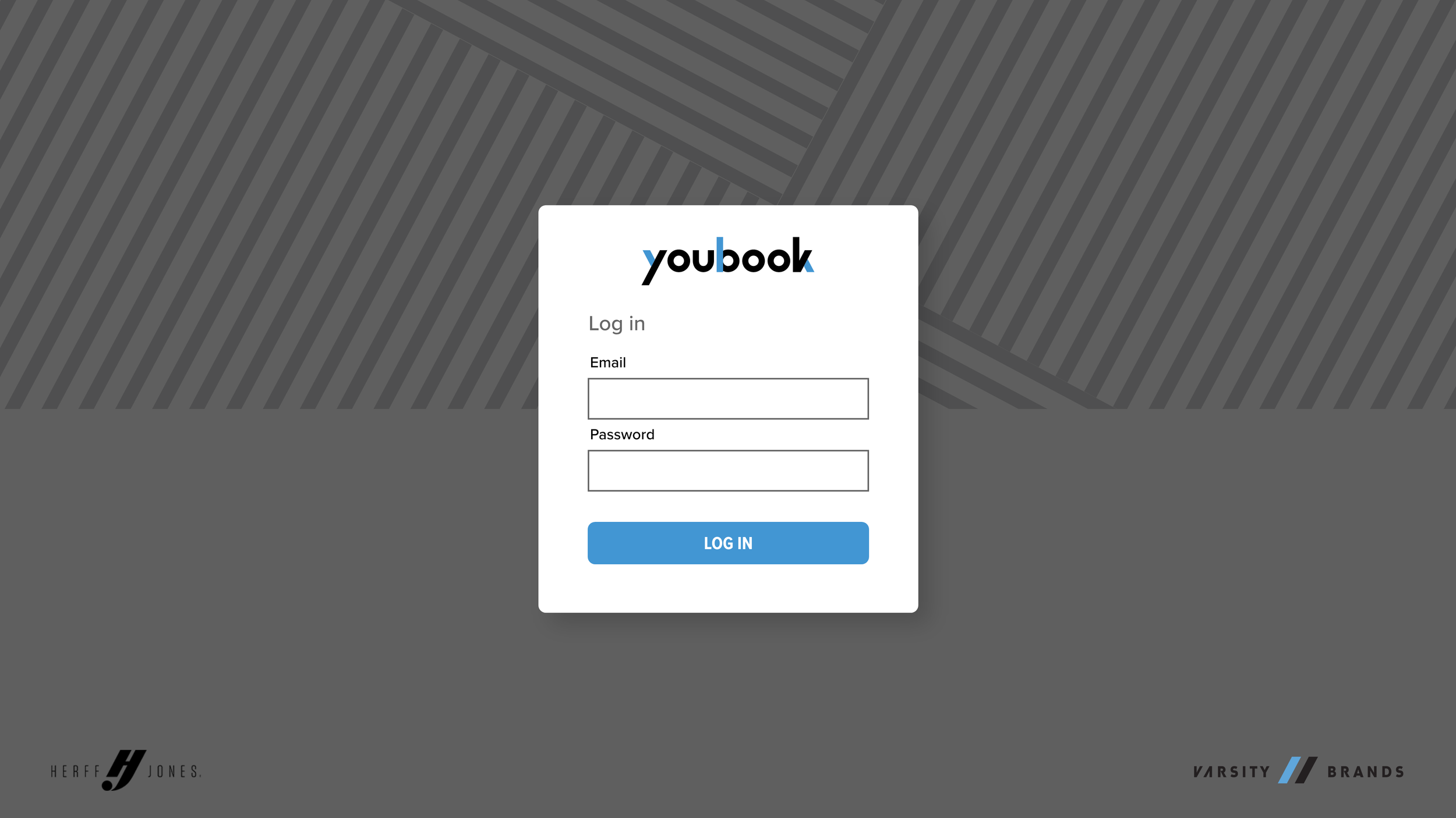
Youbook Scheduler
Youbook was developed as a purpose-built scheduling solution for the art department within the Herff Jones yearbook division. After years of relying on multiple disparate scheduling tools, it became evident that a thoughtfully designed system was needed to address the unique challenges faced by our users.
The goal of Youbook was to seamlessly integrate with existing systems, eliminating inefficiencies and to streamline workflows. By simplifying the overly complex aspects of previously used schedulers, Youbook aims to provide an intuitive and efficient solution tailored to the specific needs of its users, enabling them to focus more on their creative work and less on logistical challenges.
My Role
Concept, User Research, Design & Visuals, UX/UI
Project Duration
8 Weeks
Kickoff & Challenges
The project began with the fundamental questions: “Who are our users?” and “What are their goals?” My close familiarity with the project made answering these questions straightforward but also highlighted the potential for bias. Recognizing this was critical in the early stages of development. To mitigate bias, I conducted interviews with as diverse a group of participants as was possible to establish archetypes for the two primary user groups. These interviews allowed me to uncover the true needs and objectives of the users, ensuring the design addressed their priorities rather than my assumptions.
From these insights, the users’ goals were distilled into three primary challenges that informed the initial design approach:
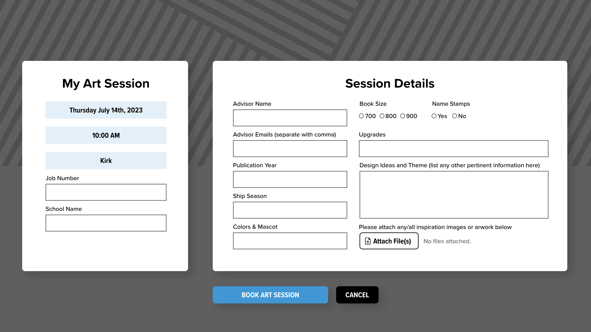
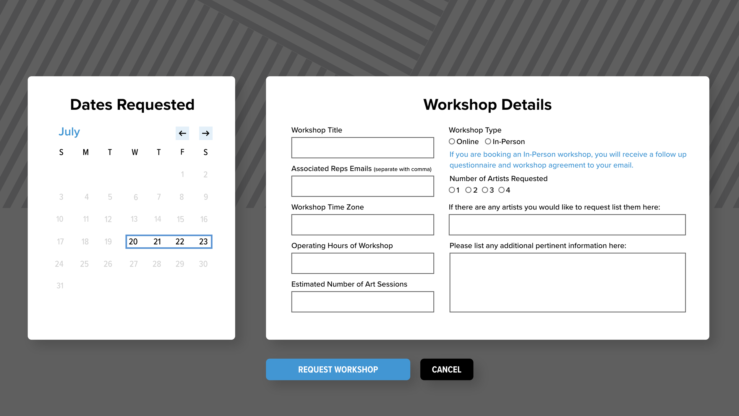
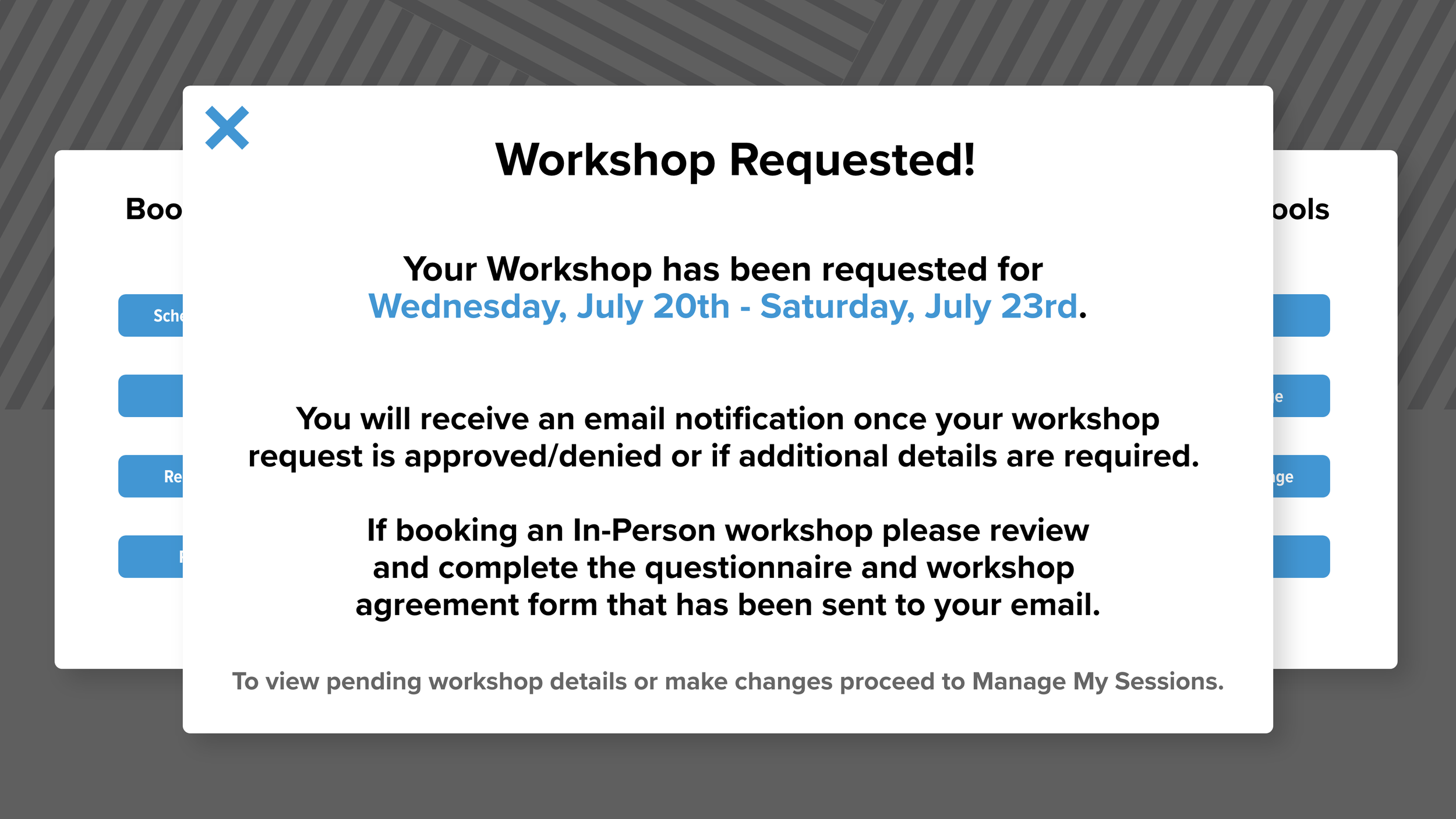
Create a Streamlined and Straightforward Booking Process
Users needed a fast, intuitive way to schedule sessions without unnecessary complexity.Simplify Without Sacrificing Granular Control
While simplicity was paramount, advanced users required options for detailed customization to accommodate their specific workflows.Integrate Existing Systems and Assets
To reduce redundancies and improve efficiency, the solution needed to serve as a centralized ‘home base’ for all art session-related activities, seamlessly integrating with existing tools and resources.
Meet Our Users
Larry
Larry is in his tenth year as a scholastic sales representative and has seen multiple iterations of the booking process over the years. Larry believes things would be easier if he could book his appointments with the specific artist he wants over the phone or email, preferring a direct approach to the complicated systems and forms he’s had to use over the years.

Meg
Meg was recently promoted to the position of Creative Artist so this is her first year experiencing the booking process. At first, she was thankful to know she need not spend her already busy day setting up appointments for sessions directly with reps, but weeks after using the current system, she has become frustrated by the lack of control and clarity on her side of things.

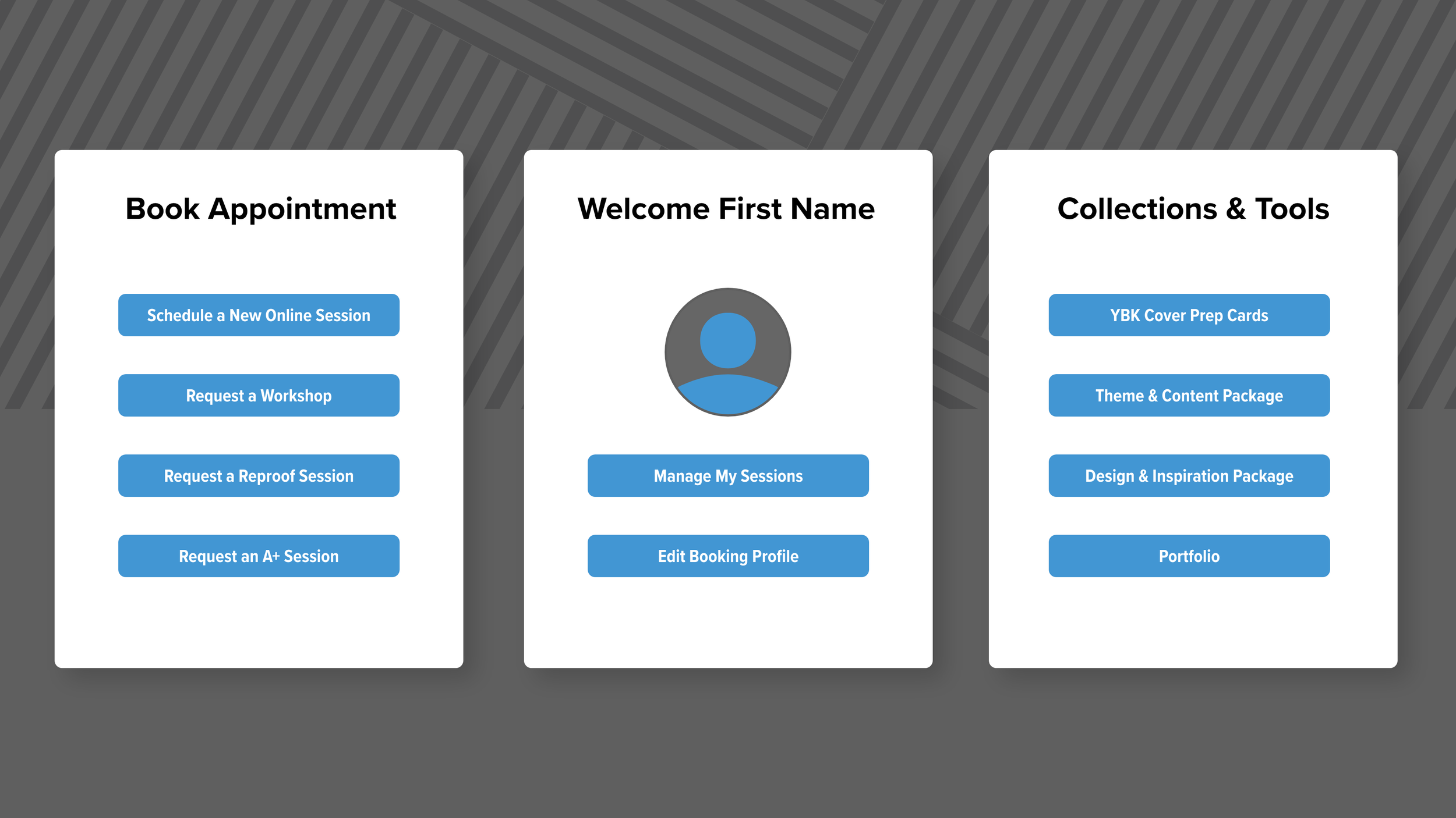
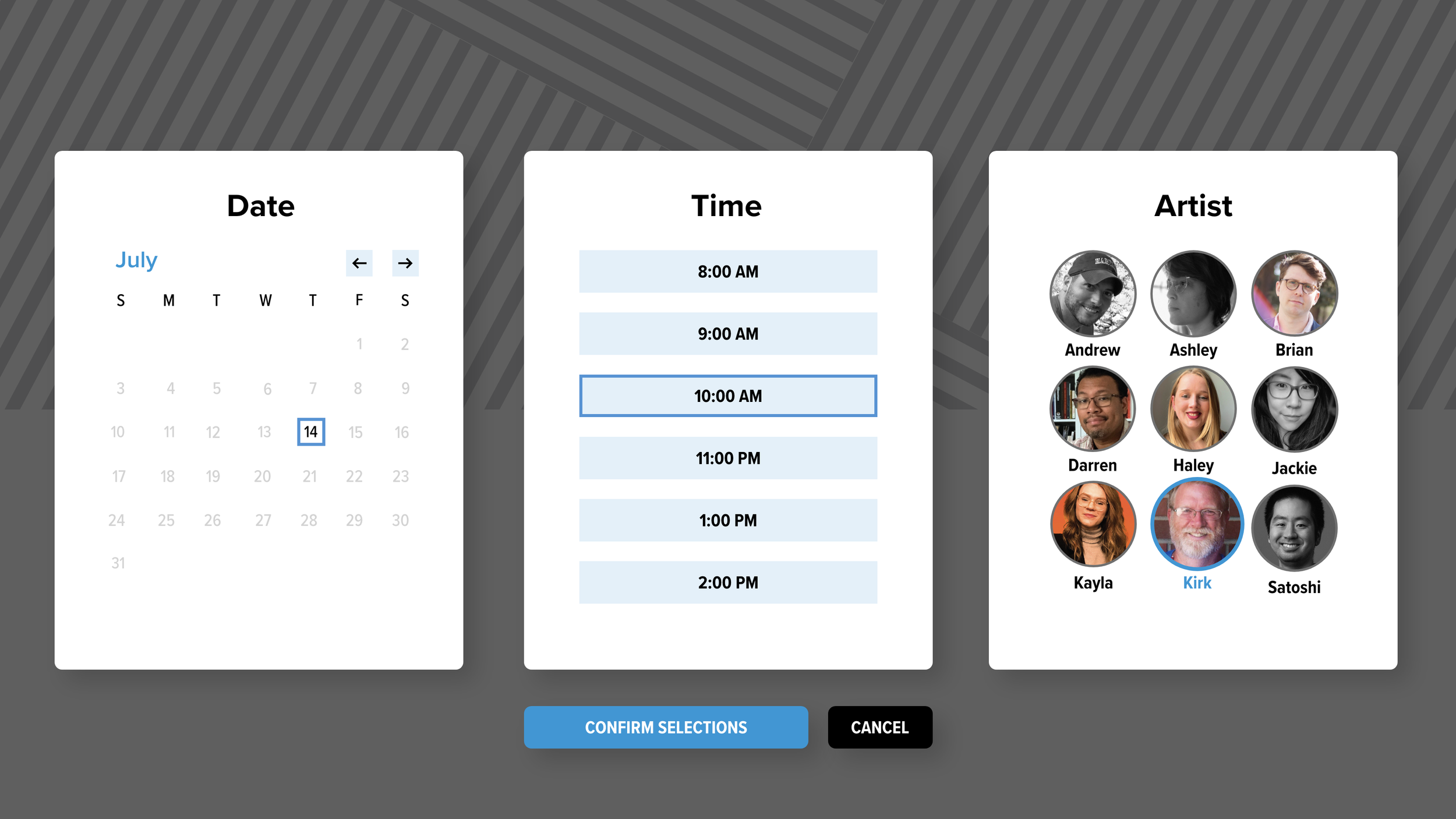
Design Evolution and Responsive Strategy
Through multiple iterations of pen-and-paper wireframes, we identified that a card-based design system offered the simplest and most effective solution for achieving a fully responsive app.
Our primary users—sales representatives—primarily interact with the app on the go, making a mobile-first approach essential. Meanwhile, artists and advisors typically access the app on desktop, necessitating a design that performs seamlessly across all devices.
The card-based system allowed us to maintain a clean, intuitive, and consistent layout regardless of screen size or user context. This approach ensured a cohesive experience for all users, whether they were managing tasks from a mobile device in the field or from a desktop workstation.